
TORONTO — Not only the leaves are changing colour in Canada this fall. W Network is refreshing the look of its brand with a new palette of colours and a new contemporary font.
The specialty channel’s distinctive W logo will remain at the heart of its brand identity, but it will be retailored with new graphic elements to give it a more modern look, parent company Corus Entertainment announced Monday.
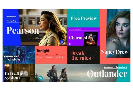
As of today, all of W Network’s branding elements will feature:
- a vibrant and bold new colour palette with orange, blue, teal, and purple hues to represent the diversity of programming available on W Network
- a new voice of the channel that is more relatable to the W Network audience
- a new and contemporary font series
- new creative structures to maximize key show visuals
- an updated tune-in approach to appeal to a younger, digital-savvy audience
The brand refresh comes at a time when W Network’s programming is ushering in a more modern and sophisticated tone for its brand, Corus said in a statement emailed to Cartt.ca. Some of that programming includes dramas such as Outlander, Charmed, and The Good Fight, plus programming resulting from the network’s most recent and growing partnership with Hallmark Channel. Aligned with the upcoming debut of the new series Nancy Drew (set to premiere October 9), the W Network’s brand refresh aims to harmonize, complement, and evolve with the channel’s diverse programming and signature storytelling, Corus said.
To watch a quick reel with the new look and feel of W Network, click here.