MONTREAL — "Brand-friendly."
That's how Quebec's independent conventional TV network described its new image on Wednesday, making its biggest change since it changed its name from TQS to V nine years ago.
It's still called V, but now with a new logo — a blocky white V in an orange square designed by Studio FEED, replacing a stylized one in a yellow circle (Ed note: which always just reminded us of Vidéotron anyway) — and a new design and motion graphics by Troïka.
"This more modern visual identity completes V’s major transformation," Dimitri Gourdin, executive vice president, strategy and communications of Groupe V Média explained in a written statement. "It highlights the passion that drives our teams and their colleagues as well as the unifying aspect of the brand that is firmly rooted in Quebec culture.”
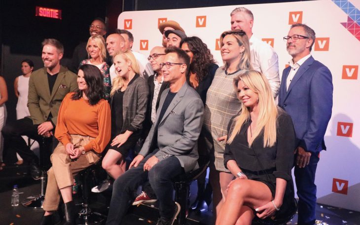
The presentation to advertisers, media and members of the public on Tuesday evening was similarly high on style and energy but low on substance. Besides an above-average turnover in programming and a new logo and visual design, not much is changing. The network is still focused on reality shows (news programming is outsourced to meet the CRTC minimum) and youth.
But V is giving a boost to the calibre of its original programs. Gone is trashier fare like Célibataires et nues (an adaptation of VH1's Dating Naked), replaced by shows like cooking competition show Je suis chef, elevator pitch show Moment décisif and making-stuff-go-boom show Ne jamais faire à la maison (Never Ever Do This At Home).
The idea is to attract advertisers who may have been scared off by V's more controversial programming of the past.
The network also has plenty of dubbed U.S. series like Scorpion, NCIS: Los Angeles and Ellen's Game of Games, and will keep its big-budget dating competition series Occupation double and 10 p.m. talk show Le Show de Rousseau (now shortened from an hour to 45 minutes).
It's also trying out something new in the morning, with Moment V, a "slow TV" broadcast from 6 to 10 a.m. weekdays that features relaxing landscape videos set to soft music.
V's sister specialty channels remain mostly foreign programming, with MusiquePlus carrying superhero fare like Marvel's Agents of S.H.I.E.L.D. and Gotham, and MAX getting medical and crime dramas, as well as programs from a new agreement with FX.
Groupe V Média president Maxime Rémillard declined Cartt.ca's request for an interview about his network's new programming.
Photo of Tuesday’s gathering by Steve Faguy, Montreal.