
DENVER, CO – World Fishing Networks unveiled a new look Thursday that encompasses all elements of network branding from on-air packaging, graphics, digital platforms to audio identity.
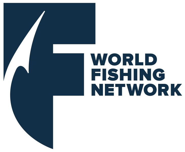
The new logo features a fishing hook incorporated into a stylized 'F,' bringing focus to the foundation of the network, according the news release. World Fishing Network's primary color palette has replaced the original orange and black mark with blue, symbolic of the natural outdoor environment and great fishing destinations.
This marks the first update to World Fishing Network's brand identity since it launched in December 2005.
"We explored different concepts over the past year after our research led us to conclude that many anglers and would-be-viewers did not identify with the letters WFN, especially in markets that recently launched World Fishing Network," said Pam Stinson, VP of marketing, in the release. “With participation in fishing seeing a renaissance in recent years, this re-design helps us sync up better, not only with our current audience, but the younger generation of anglers participating in the sport as well."